Recently there have been many questions in FB forums about incorporating text in knits. The techniques can vary depending on available tools. The most basic method is entering vowel and consonant shapes dot by dot in paint programs, with each dot becoming a pixel or punched hole in the final image. There are many free downloadable fonts for personal use that produce images that can fairly easily be translated this way, among them:
https://www.fontspace.com/munro-font-f14903
https://www.1001fonts.com/subway-ticker-font.html
https://www.1001fonts.com/01-digit-font.html
https://www.1001fonts.com/loud-noise-font.html
https://www.1001fonts.com/arcade-font.html
https://www.1001fonts.com/mobile-font-font.html
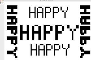
Knit stitch shaped units
https://www.fontspace.com/xmas-sweater-stitch-font-f28134https://www.fontspace.com/christmas-jumper-font-f21275
https://www.fontspace.com/knitfont-font-f6001
Notes on using GIMP update for Mac 2019, I had a quick FB share for a first exploration using Gimp:
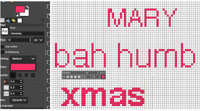
“I have not previously put much effort into using text in gimp. A quick start: image 200X200,1800 magnification view grid, snap to grid, work in RGB mode, not indexed,
turn off anti-aliasing, it wants to smooth edges. Caution should be exercised when using antialiasing on images that are not in RGB color space. It is an effect used to smooth edges in bitmapped images and will blur the edge pixels to transparency.
In this instance, ultimately working in lo-res black and white for downloads, you want to keep the jaggies, not average them out.
I believe Passap actually has a built-in command to “smooth edges” in images downloaded into it. I have always preferred manipulating the images myself rather than relying on software to do it for me.
Start with a font size of 12 in the chosen font, and increase the font size if letters are too close together, the result is easily changed to black to make it ready for downloads, obviously not an answer for tiny letters. My capitals are font size 12, and the other 3 words size 16 to maintain spacing between the letters”
 Getting a bit more methodical,
info from the Gimp manual: Text management, Text tool
In addition, there are good online videos on this topic, but they are intended for use in much larger canvases, often using 150-200 as the font size, whereas in knitting that is likely the limit of our canvas size when planning for programming the full needle bed.
I am working on a Mac. From Windows tutorials found on Youtube, it appears there still are differences in some of the content and optics between the two platforms. A note: version 2.10.34, 2023 begins to incorporate some of the Windows commands in the Mac version.
Gimp is the only program that I personally prefer and use dark mode. To change the app’s appearance, the selections for dark, gray, or light themes may be made by choosing system preferences, then clicking on the theme, and selecting from options available on the right  a partial illustration of changes in the grey and light themes
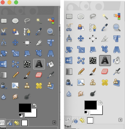 Text may be activated by choosing text in the image/ tools menu
 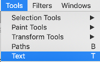 by clicking on the tool icon A in the toolbox
 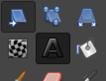 or by using t as the keyboard shortcut, then clicking anywhere on the canvas.
Click on the fonts button Aa to open the font selector
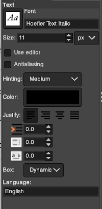 At the top of the Text tool dialog, the current Text Size, 11 in above, is shown in either pixels or points. A pixel is the smallest component in a bitmap image, and all measures in pixels depend on the screen resolution. A point is a fixed value, one inch is the same as 72 points. Standard screen resolution is often 72 pixels per inch, in which case text in pixels will be the same size as text measured in points.
You may also type in the name of the font you wish to use,  choosing from installed fonts. Text editing can happen by selecting buttons here or with direct on-canvas editing by making the changes within the semi-transparent floating toolbox on the canvas itself.
If you prefer to work with dockable dialogues go to and choose Windows, Dockable Dialogs, Fonts, and options will appear on the right 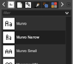 As long as a text box is active, making another selection from the fonts menu will instantly change the box content, creating a preview each time.
As mentioned, Antialiasing is best turned off when not in RGB color mode
Hinting “Uses the index of adjustment of the font to modify characters in order to produce clear letters in small font sizes” is helpful in lo-res text intended for knitting 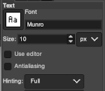 Color default is black, click in the box beside Color selection and a dialogue selection box appears for changing it
 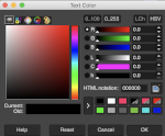 The choices listed at Gimp.org for text directions include the standard right to left, left to right as in most languages, and the following for vertical text
 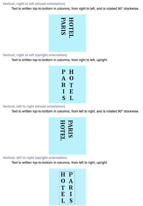 After the text is entered on the canvas, right-click on the inside of the text box to change text direction
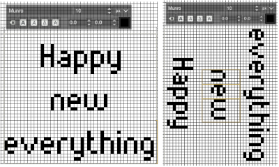
 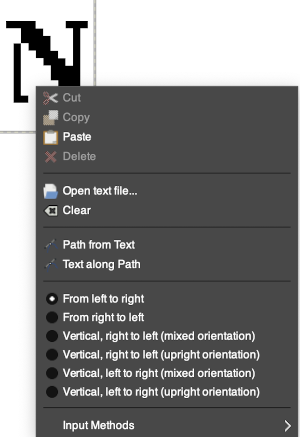 It is not necessary to work with the layers menu to start with. It is possible to “wing it” to get a starting sense of the process. Scaling and transformations are available, starting on a canvas size less than 200X200 based on needle counts on a standard km providing an ample field on which to play. If the intent is to change the direction of all the entered text, Image/transform may be used. Entering the same text in the same font size in an altered direction can change the overall pixel counts
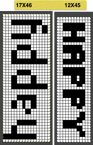
 After the chosen text is placed change its mode from RGB to B/W indexed, then crop the image to your chosen size. Export.bmp, the result loaded into img2track and Ayab
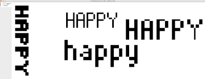
 For a different way to edit, choose Image/Flatten and individual components may be reconfigured on a new canvas to a very different size. This file is now 68 stitches wide, rather than 144
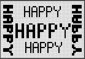
 The usual text alignment rules apply in text boxes as well, left to right
 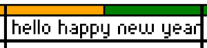 using the return key, double-clicking in the box will highlight each letter and activate view grid should you wish to count pixels in each
 ![]() Text center-aligned
Text center-aligned
 Getting more control of the process: after the text tool is highlighted and clicking anywhere on your canvas two things appear automatically. The four little boxes represent the text box, which is dynamic by default and grows in size to accommodate typed text. Anytime you click on the canvas a new text box is created.
To change the size of the text box and you want the text to fit in a specific area, click and drag on one of the lower, small exterior boxes, and release. The box then becomes fixed, and the text will move automatically to the next line and is placed according to alignment settings. If the bottom of the text is cut off, click and drag on that small square on the bottom corner or the bottom line of the text box shape to expand its size to include it in full.
Double-click on a line of text to reveal those outlines around each letter or click and drag right or left on full words for editing. Click on a single letter space to delete it. Repeat if needed, type in the new letter(s) for a spelling correction or word change.
If following Windows instructions, it is helpful to know the comparable Mac commands ![]() pictured here on the bottom left of the Mac onscreen keyboard
pictured here on the bottom left of the Mac onscreen keyboard ![]() Use the option key and click on the canvas, and drag to place the text box on any specific area, or also to move all content in an existing text box, choose the move tool
Use the option key and click on the canvas, and drag to place the text box on any specific area, or also to move all content in an existing text box, choose the move tool  then click on any letter within the text box and drag and place. Random placement in the text box will move the whole layer
 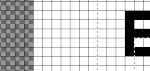 The spacing between the lines and between the letters may be adjusted as well. Clicking on the arrows to change the values here is one option, negative or positive numbers may be used
 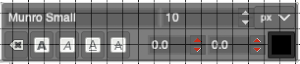 or what appeared easier to me, the same may be done here
  A sample of adjustments in line spacing
 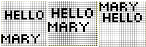 Very small fonts are likely not to have any room for decreased spacing in the between letters in strings of text.
A reminder before converting to .png for download
flatten image
convert mode to indexed B/W
crop content to the desired size
export as .png
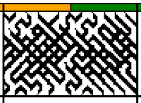
Font: mazeletter
final image loaded into img2track and Ayab ![]()